
Creating an Illustration Library
As a service designer for the HCDU (Human Center Design Unification) Team, I worked on this project for 3 weeks, designing and building the Illustration Library using Figma.
CMCS (Center for Medicaid and Medicare Services) deliverables were visually inconsistent. Staff members were forced to hunt for their own graphics, which didn't just look messy—it increased the mental load on the people reading the reports and the people making them. My team saw an opportunity to enable people to create and customize visuals that meet their specific needs without sacrificing the consistency of the MACBIS community.
The Challenge
How can we create consistency with icons and illustrations?
We didn't want to be a bottleneck for the organization; we wanted to empower it. Our goal was to create a set of reusable illustrations that felt like a natural extension of the existing CMS Design System.
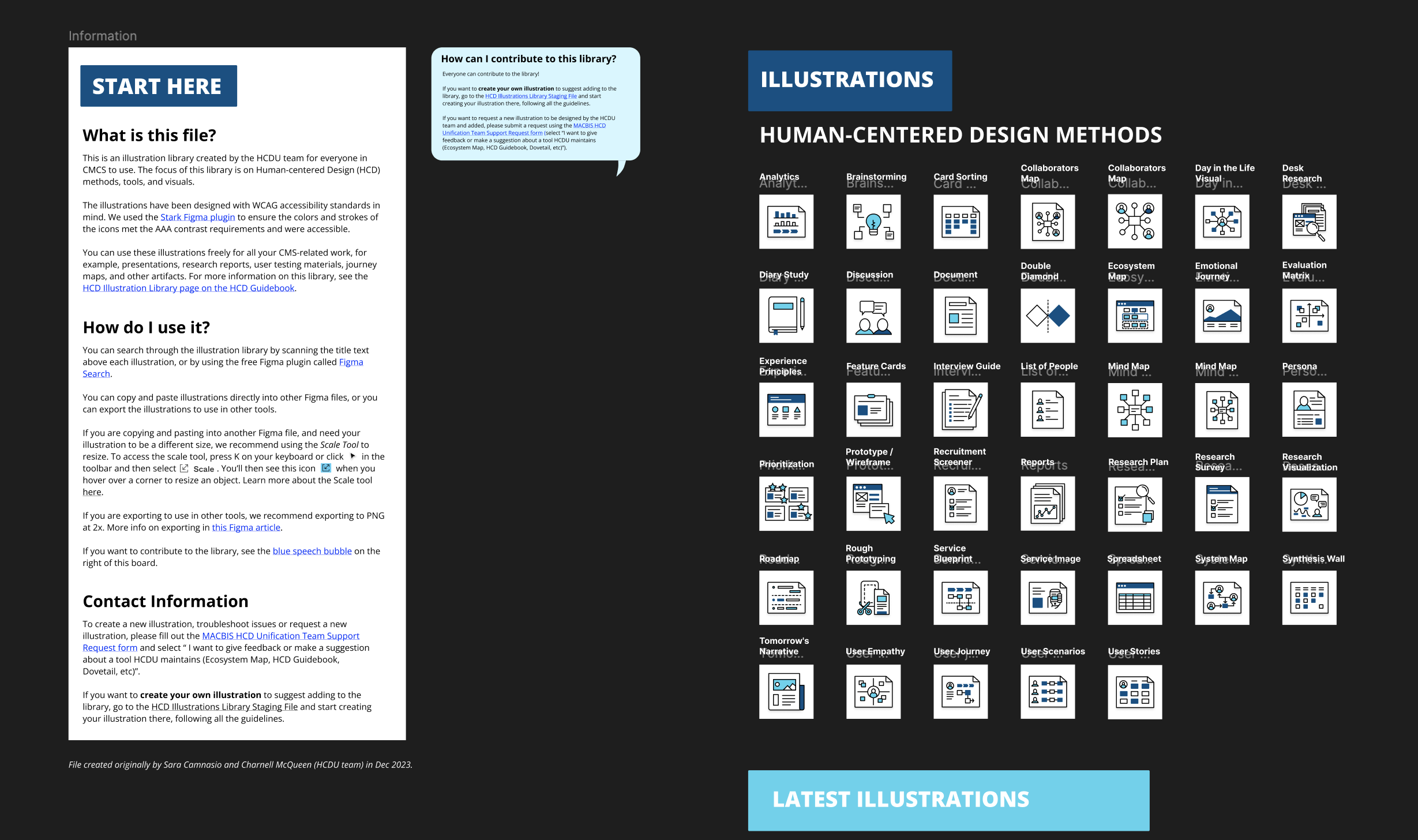
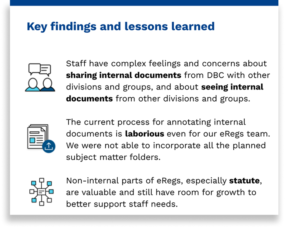
Reusable Assets: We started by creating a foundational set of illustrations in Figma specifically for internal artifacts—things like research reports, user testing materials, and journey maps.
The "Style Guide" for Everyone: To ensure the system could grow, we provided clear guidelines outlining how community members could create their own illustrations in a consistent style. We weren't just giving them fish; we were teaching them how to fish in the same style as the rest of the pond.
Complementary Design: We intentionally designed these illustrations to complement (not replace) the existing CMS Design System icon library, encouraging teams to use the official icons alongside our storytelling components.
Strategy
By filling this gap in the branding guide, we turned a "fragmented" deliverable process into a streamlined, high-quality experience.
Reducing Mental Load: By standardizing the visual language, we made it easier for leadership and staff to digest complex information across different missions.
Scaling Consistency: The "Staging Ground" and the "How-to" guides allowed teams to feel a sense of ownership over their visuals while staying within the guardrails of the CMCS brand.
Impact
Delivery
By the next quarterly report, the vibe had completely shifted. Instead of a bunch of "islands" presenting separately, we looked like one unified unit.
I’ve learned that if you want to change an organization's culture, you have to design the support system first. With a clear process and a safe playground, we took the mental load off our coworkers and gave them a shared language. In the end, the most powerful thing I designed wasn’t the icons or illustrations but the trust that the team finally had the right tools to do their best work.