
Project Overview
My Role: UX & UI Designer, Information Architect, and Researcher
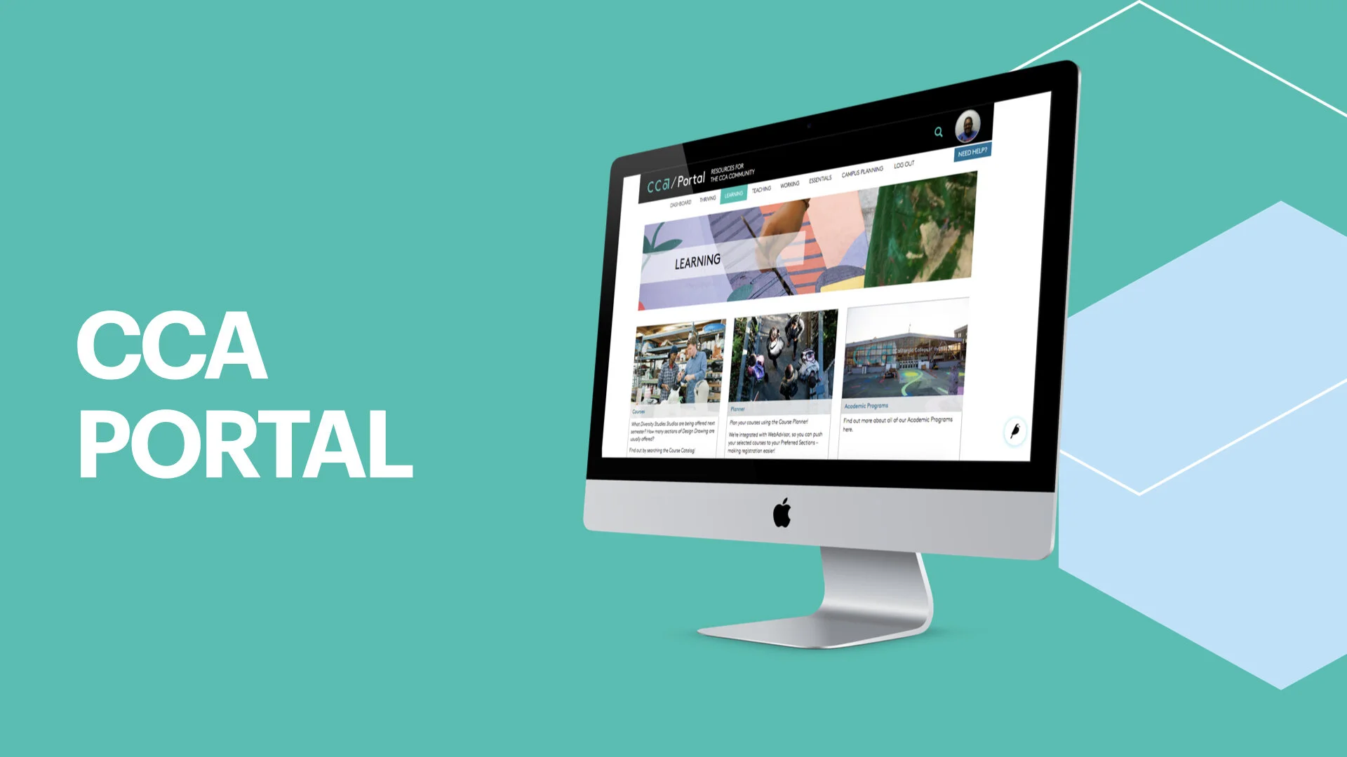
Live Link: https://portal.cca.edu/
Team: ETS Web & Mobile Team
Duration: 3 years +
Tools Used: Adobe Illustrator, Adobe Photoshop, Wagtail, Google Suite, and Airtable
The Challenge
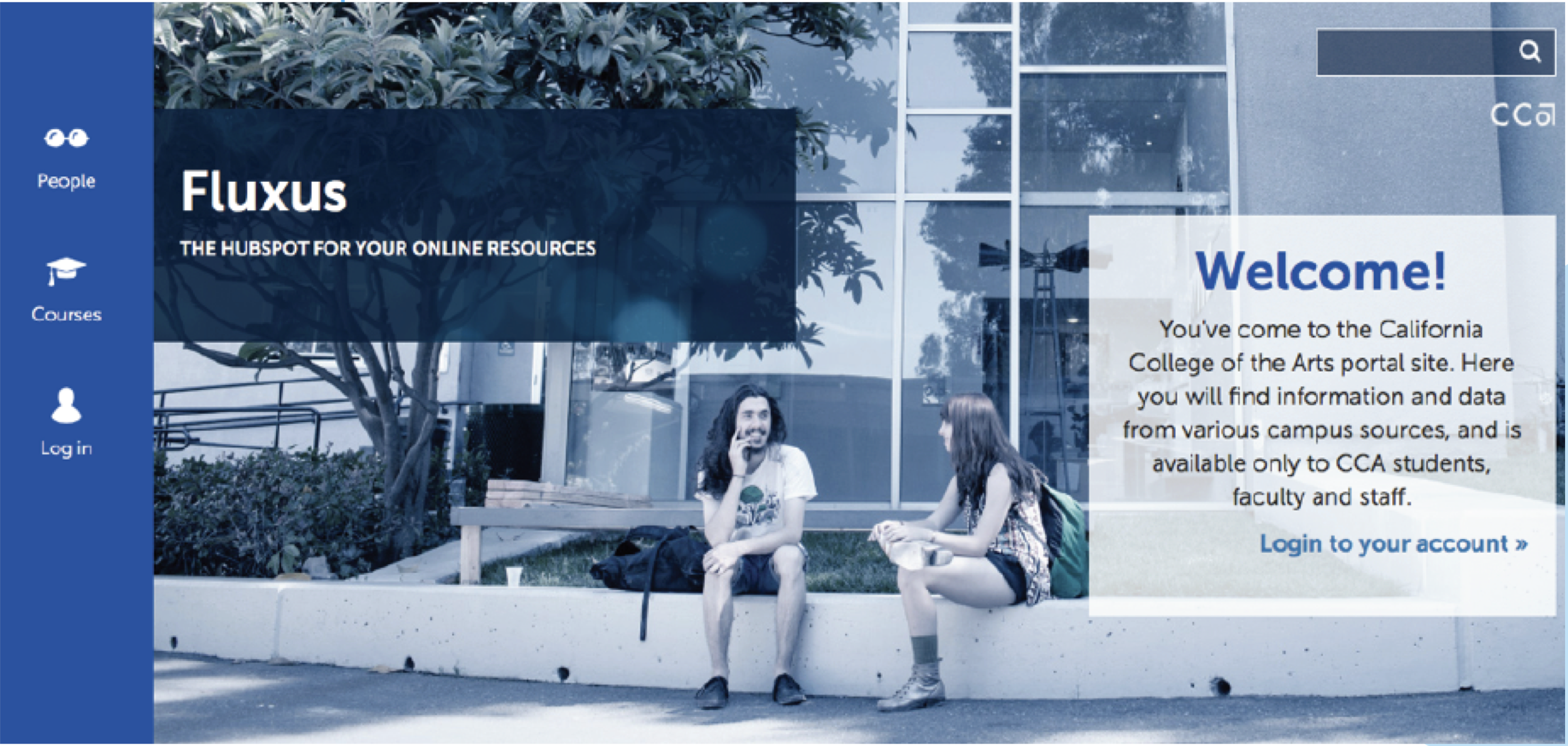
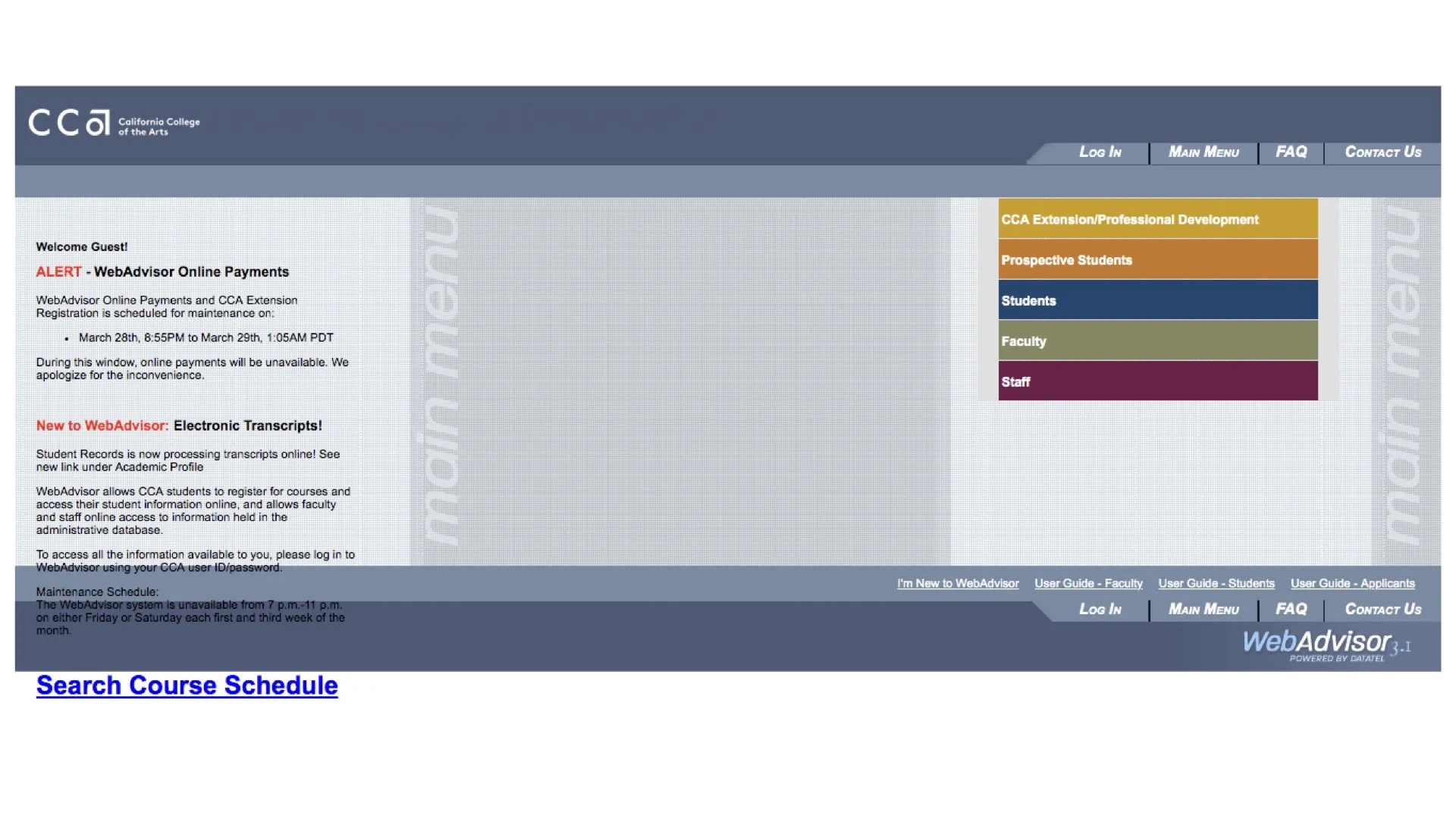
The California College of the Arts (CCA) relies on a multitude of platforms for education support. Unfortunately, this means that students, staff, and faculty struggle to find current and relevant information at any given time.
The team had already identified two major struggles the CCA community was having:
1 . People were struggling to find current and relevant information. The creators of content didn’t have access to change their information, so it became outdated.
2. Another struggle was that CCA staff and faculty use a lot of different platforms for content and information. From what is taught in the classrooms and what resources are provided by the school. So there was a lack of consistency and findability.
Our challenge was to create an intranet for the CCA community to surface relevant content in an accessible way.
Discovery & Define
Our first step in our process was diving in deeper to understand the problem through research.
Research Methodologies Used
Competitive Analysis - We researched different art schools, institutions, and web platforms for inspiration and design trends. We looked at schools like Prat and RISD and websites like Netflix and Medium. They all had different attributes we wanted for the Portal.
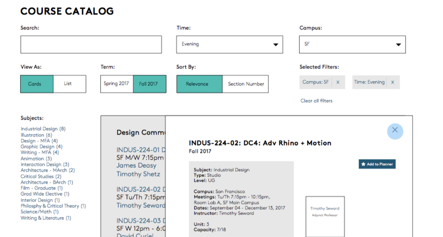
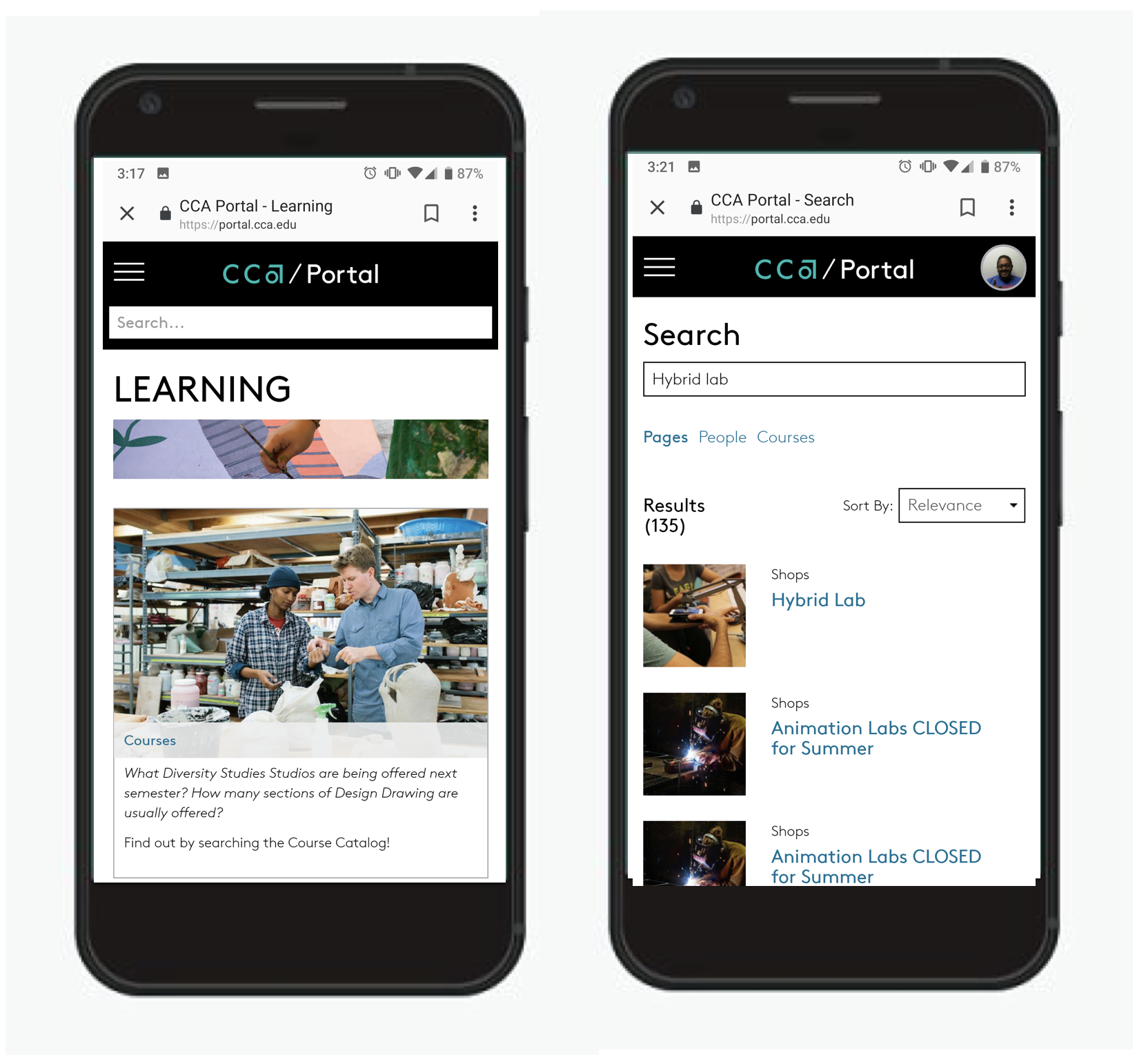
Usability Testing - We tested with a lot of the student populous in communal areas where we asked users to preform task they would need on a daily basis (such as what time does the print shop open and close? What training do you need to use the 3D printer? What classes are available in the fall term for their major?)
Tree Testing - Early on, we tried different navigation sets to see if we were grouping content in the right location and where future content could live as well.
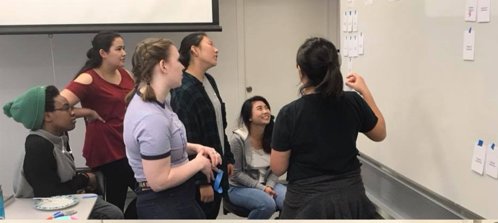
Next was to start drafting ideas and creating user stories and wireframes.
Ideation & Design Process
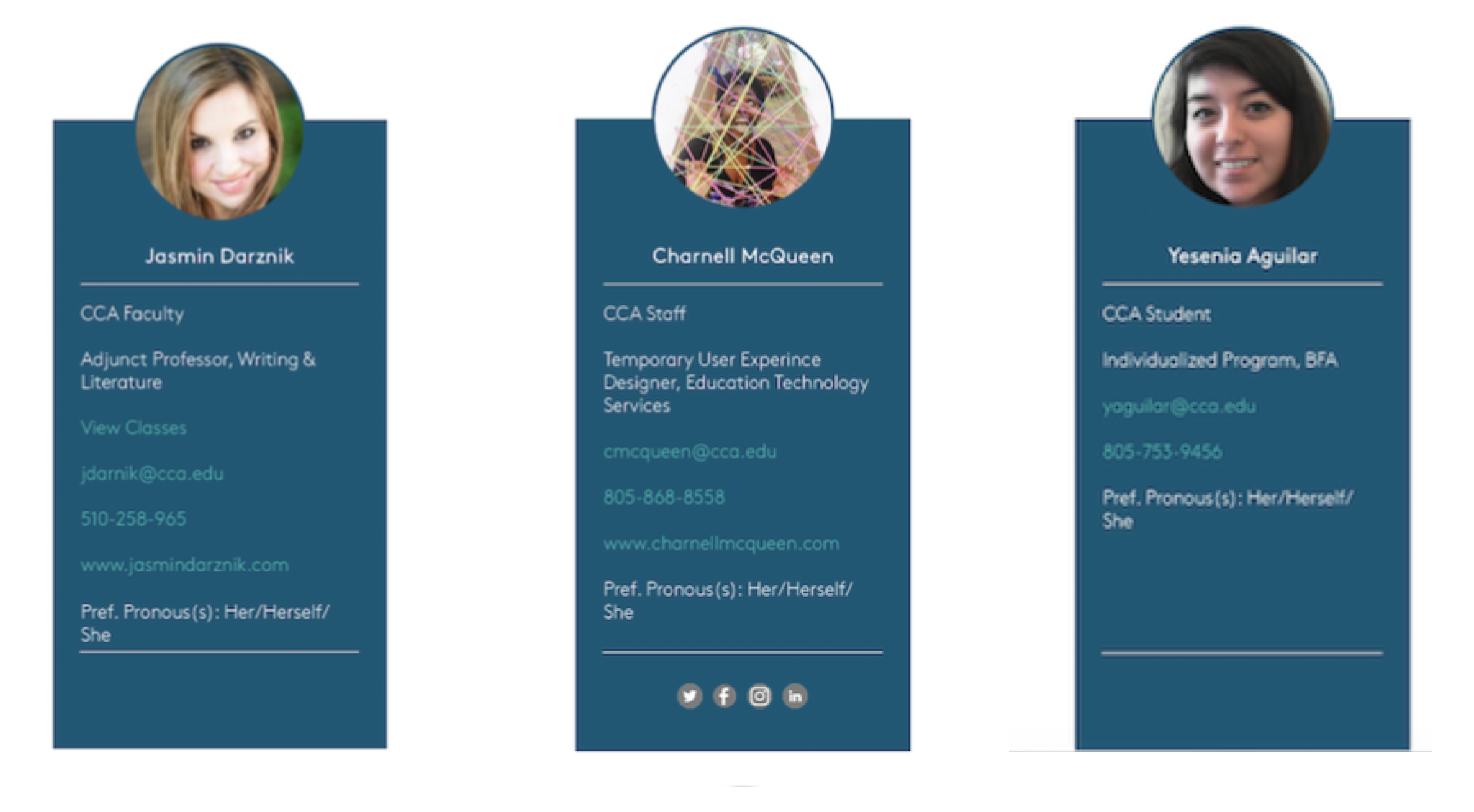
We created personas to navigate how each person would potentially use the Portal. A student would have a dashboard that showcased their classes, while a staff member would have a timesheet or task sheet of things they needed to complete for the day. This opened up a conversation about access and complex users (students who were staff and vise versa). The Portal allowed for content creators and moderators. So we had to think about the chain of command.
Design & Implementation
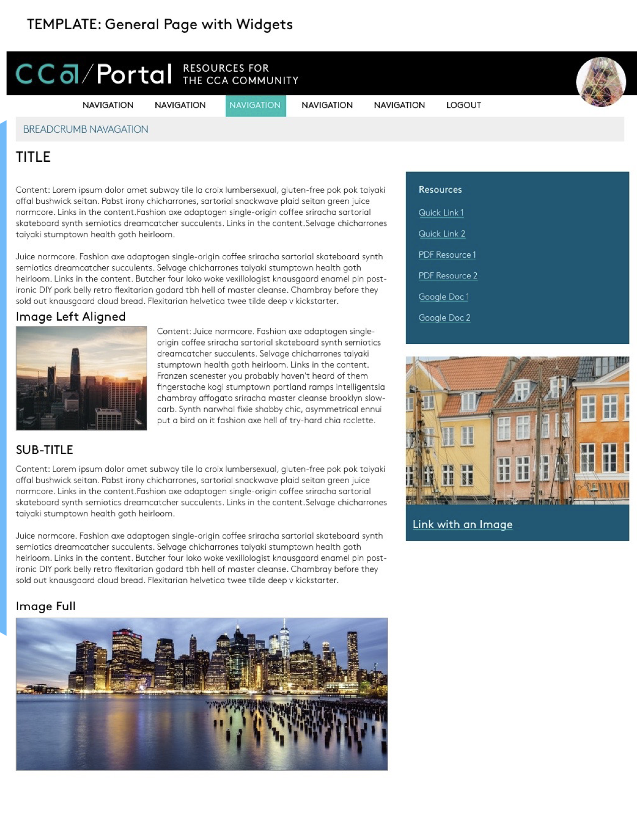
Here, we started laying down the groundwork for how everything would look and operate. This was where all the sketches became digital, and wire framing became more detailed. One of the cool things I got to be a part of was the backend process.
The developers used a content management system called Wagtail. It was a Python-based system that was very developer-friendly. Throughout the process, I was collaborating with the devs to create new widgets and modals to be more user-friendly.
I defined best practices as well as documented, and trained users on the Wagtail interface. Looking for feedback and the quality of use. We wanted to make sure people were able to use it easily and wanted to use it.
Deliver
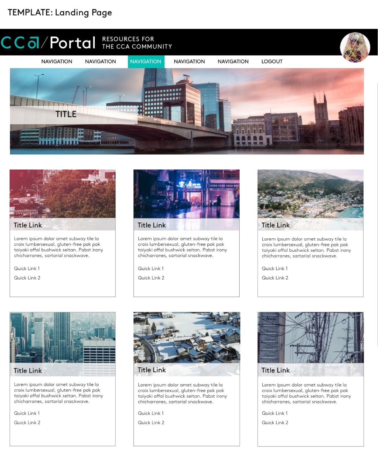
Finally, after multiple iterations, updates, and critiques from the team and students (art students are very critical), we implemented the new branding from Mar/Comm (Marketing and Communications) but added our unique twist. I was lucky I got to design for a responsive web, where pages rendered on different devices. So I made tweaks to mobile where the real estate wasn’t as large, but kept it consistent from web so people wouldn’t feel disoriented. I created a lookbook of page templates with documentation and best practices for new content creators in the Portal.
As the needs for the institution grow, so should the Portal. And it has! We designed for the expansion of not only the needs of the students first, but also the staff and faculty as well.